Monthly Archives: December 2010

Proud Cardinal

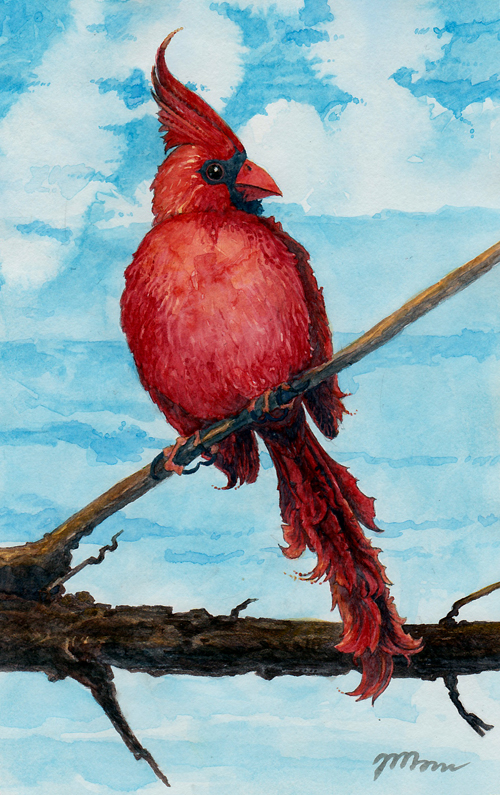
I began my “Proud Cardinal” painting with a detailed pencil drawing. Many of my watercolors are started with a watery wash of color over blank paper, then a general pencil sketch, and then I dive right in to the first stages of painting. However, after drawing several sketches of cardinals, I felt like creating something more substantial in pencil as a beginning to a watercolor. (I love to draw with a mechanical pencil. No time sharpening = more time drawing.)

Next I added just a hint of cerulean sky. Here you can see my dreadful palette. Well, it would be shocking to some, but as my space is limited, so is the size of my palette. One of my favorite attributes of watercolor is its ability to be reconstituted and used again once dried. Once my palette becomes too crowded, I wipe down a section of the palette if I need to create a specific space for a color (like I did here, for the blue of the sky).

I added more color to the sky, and I added the first layer of red on the cardinal and brown on the branch. To the right of the painting in the photo, you can see a scrap of some junk mail from a collage I was creating at the same time, about which I will write later. Notice the texture in the sky, formed by the natural way that watercolor dries when I paint with lots of water. It will help form the shape of the clouds later, though at this point I was planning on leaving the sky as-is.

Atmospheric layers of yellow and blue were painted onto the branch for light and shade, and I painted another layer of red on the cardinal, in which I added more details to the feathers and got closer to the saturation of color I wanted to achieve.

I worked a lot of details into the clouds next because I felt that the painting lacked unity between the sky and the cardinal. The clouds have lots of detail over the top of the painting, fading to areas of less definition and color saturation at the bottom, giving depth to the painting’s background.

Next I started adding details to the cardinal in dark navy blue. Most of the details in dark blue were painted over the heaviest pencil details, emphasizing their shape and tone. At this point, I felt like the painting was really coming together.

Here you can see the painting in its penultimate stage, along with my palette again, in case you are interested in its evolution. I finished painting the navy details on the cardinal, and I added lots of bright red details to the feathers, particularly on the chest and back of the head. I saturated the red on the wings and tail, creating more contrast between the bird and the sky.

Although the cardinal was a bright, striking red, I felt a lack of atmospheric light in the painting. It appeared a little too flat and needed a delicate burst of warmth. I added a few areas of faint but bright yellow washes over the branch, the cardinal’s feathers, and his toes. Tiny dots of yellow and red followed the curves of the feathers for a final flourish.

proud cardinal bird original watercolor painting red

This painting is for sale in my Etsy shop.

Step by Step for “Rainbow Owl”

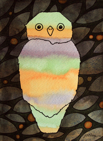
“Rainbow Owl” is a flatly patterned, colorful painting with a limited palette, created as part of my bird series of watercolors. It started with a wash of bright, loose stripes in orange, lilac, and pale green. I studied several photographs of owls and made various sketches to refresh my hand with the basic proportions, posture, and shape of an owl. After that, I made a simple outline drawing of an owl in pencil over the striped painting, and traced over it in ink.

I painted the background a dark grey,

and when it dried I drew leaf and berry shapes across the painting in ink.

I painted around these shapes with a very dark forest green.

Then, to bring more color unity to the painting, I painted the berries bright orange while the green was still slightly wet, so the brightness of the orange berries would vary over the painting and give it a little artificial depth.

After it dried, I signed it, and I thought I was done. Then I noticed three small dots of grey paint which had splashed into the body of the owl, marring the broad green stripe across the owl’s wings.

Removing watercolor from paper can be risky. I could end up with scuffed paper, which can happen if it is rubbed vigorously while wet, which would rather ruin my little painting. It would also be possible that I would remove, along with the dots, the color underneath, wrecking the soft wash of color. Replacing it can’t produce just the same effect as a fresh wash of paint. I considered adding more lines in ink to the back of the owl, as a fix, but I wanted to keep the simplicity of the painting intact. My choice then, was to try and remove the dots with a slightly damp mop brush. I think I ended up with great results, removing only a trivial amount of the color behind them. Here is the finished result:

http://www.etsy.com/listing/63108694/rainbow-owl-original-watercolor-painting

I had great fun playing with these colors and shapes, adding little details of feathers in the outline of the owl and letting the watercolor swirl amongst itself to create variations over flatly painted areas of the composition. This painting is for sale on Etsy, along with many more of my paintings and drawings.

Edit: I’ve painted another owl and have written about it here.

Makeover

As you may notice if you’ve visited my blog previously, it’s gone through a bit of a change in the past couple of days. I chose a new visual format which allows me more space for banner design, but is still pretty simple. With my last theme, I had some trouble designing my headers in such a small space. I wanted them to be more bold and noticeable, which was achieved neither by the size (teensy) nor the location (hinged to the very top of the page). I didn’t have fun with it. At first, I looked at it as a challenge, and though challenges are welcome, there’s also something to be said for allowing myself a certain amount of freedom on my own art blog! Then, browsing around artist pages, I found this colorful and fun art blog: http://blogdelanine.blogspot.com, and that was kind of the last straw for me. Look at that banner! All that elbow room… I wanted that. (Also, click around that blog. I love her work.) I’m much happier with this header format and will stick with this one for a while.

I’ve also decided to connect this blog more with my Etsy shop, since I’ll be posting more often about the creation process of my paintings which I sell. So I’ve changed the name from ‘The Canvas’ to ‘Jem’s Imajes Art Blog’ to keep the branding parallel (however, my URL remains the same, so no need to change your bookmark).

This blog started as a way to get myself drawing and painting more regularly again, and I am so happy to say, it has fulfilled its expectations quite nicely. Its new job is to support my shop and the ideas and processes behind my work, and I’m excited to see where it takes me next.